DECEMBER 2023
TANIM
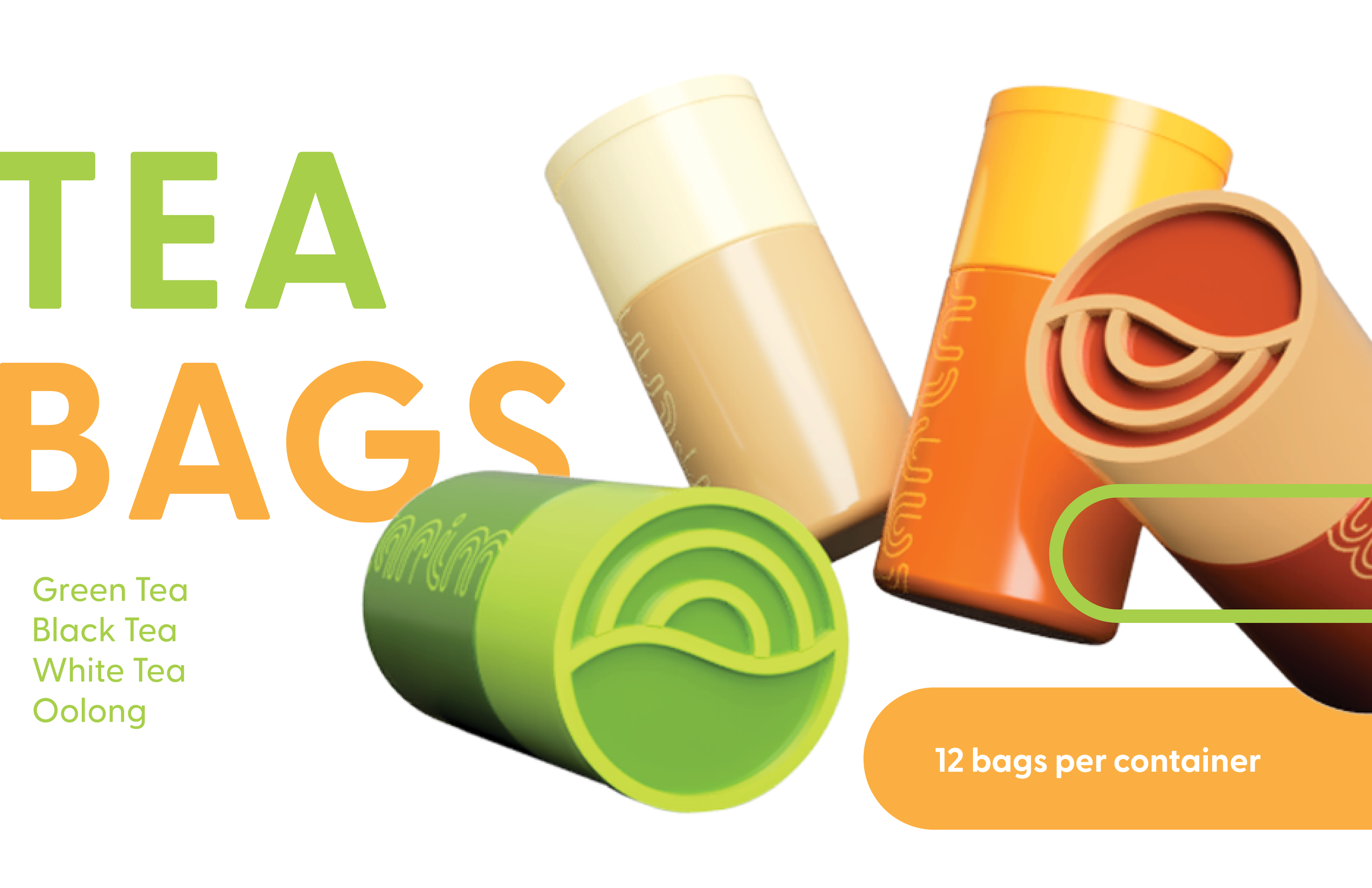
Tanim is a pop up kiosk aimed to introduce tea to college students as a caffeine alternative, as well as advocate for practicing mindfulness as a way to help reduce anxiety and stress. The kiosk is designed to fit in a 10 feet by 12 feet space. The kiosk sells tea bags as well as made to order drinks.
CONCEPTUAL DESIGN, BRANDING, PACKAGING, 3D MODELING, IMAGE MAKING, TYPOGRAPHY

LOGO + LOGO TYPE
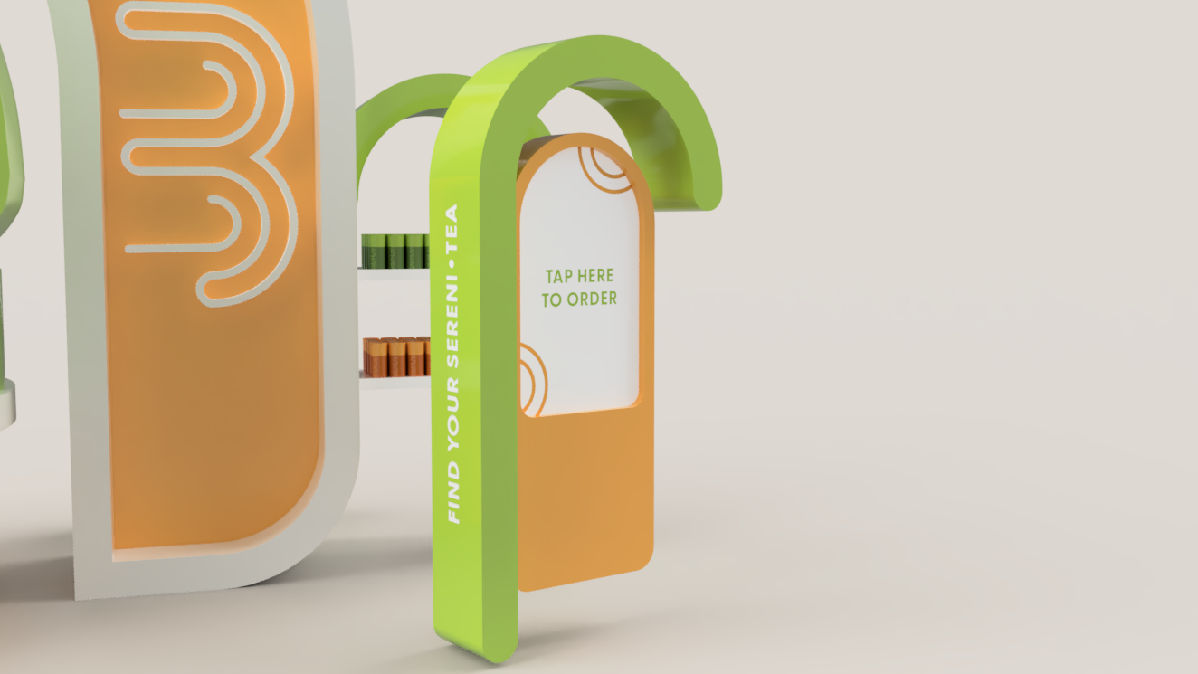
The name “tanim” (pronounced tah-nim) was derived from the latin root “anim” which means life, soul, and mind. The logo type was designed with the spiral shape in mind, with the thought of it translating into a neon sign for the kiosk.
At first, my designs were mainly focused on earth theming and the use of leaves. As my sketches evolved, I started looking for less literal imagery, and focused more on the feeling and message that the company would want to convey.
As the brand was advocating for mindfulness, I decided to look into universal symbols for being calm and relaxation. I found that spirals were common imagery for that emotion, and decided to incorporate it into my design. I was also interested in using sunrise imagery and nature since I was building a tea brand.


Kisok Sketches
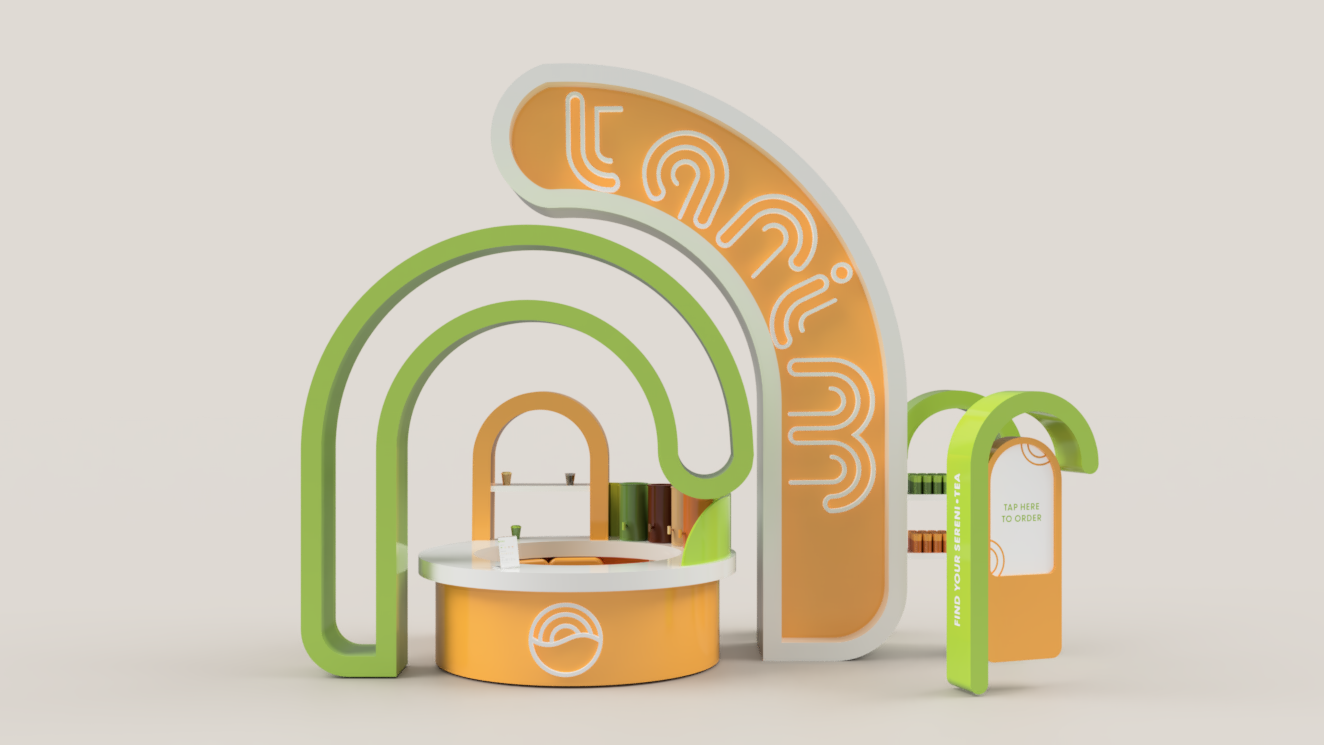
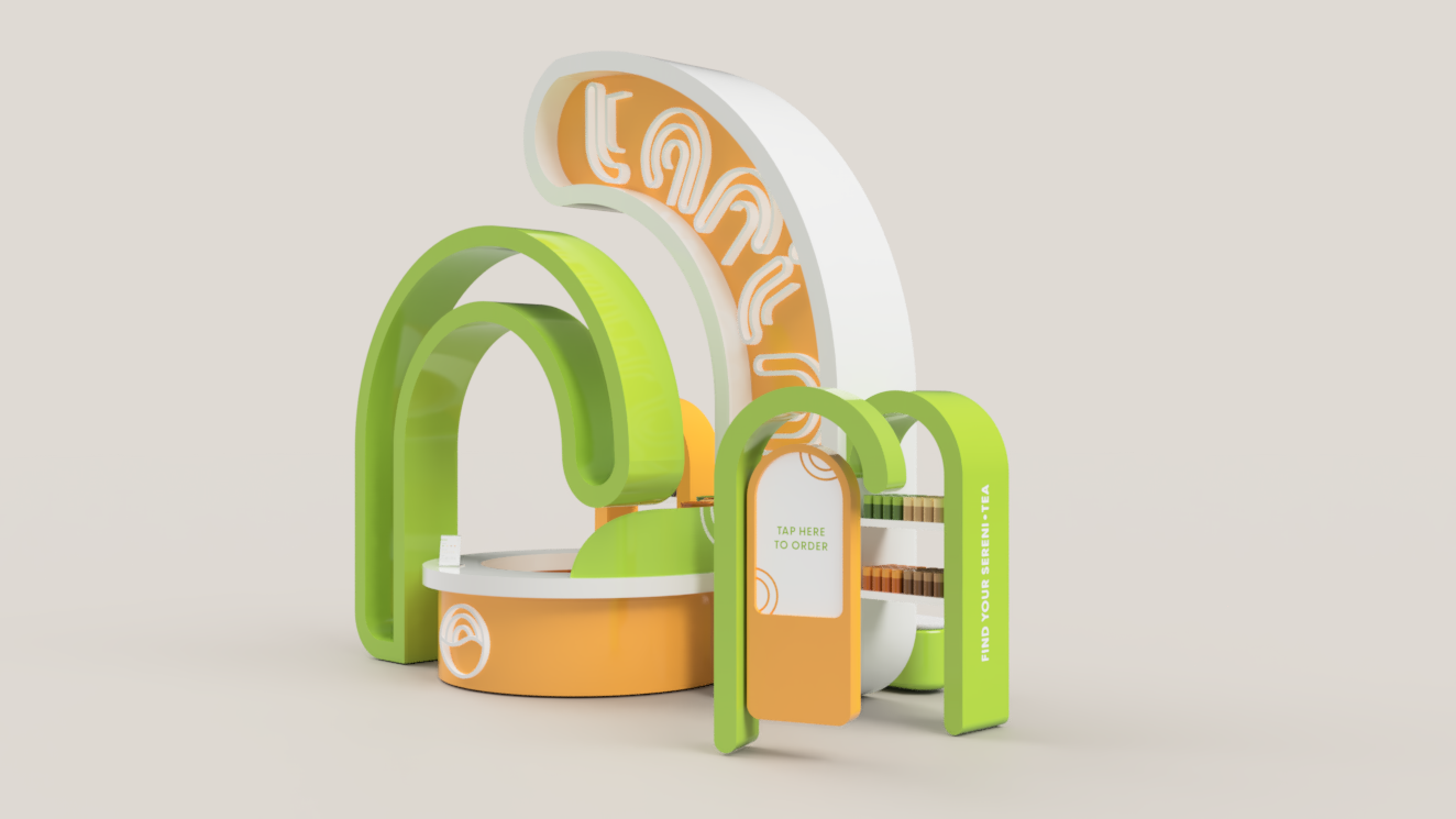
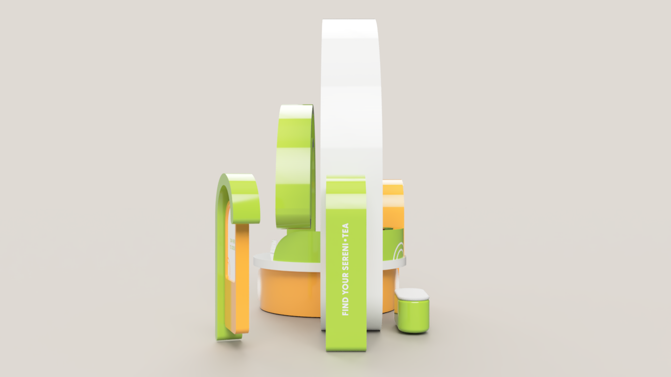
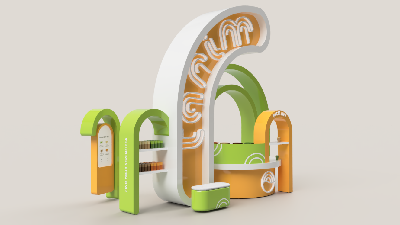
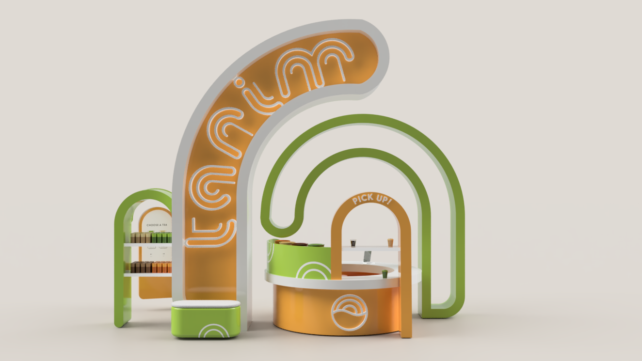
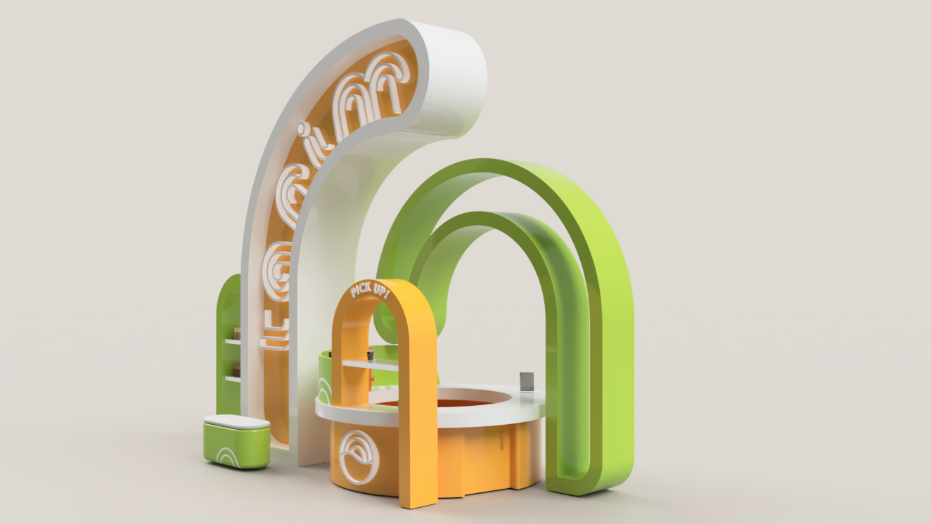
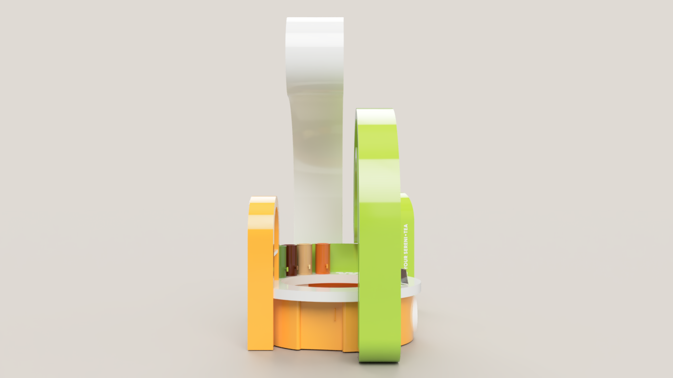
From the beginning, I was always planning of using the spiral shapes as structures for the kiosk. Later while rendering, I decided for the spiral structures to be the ones from the letters, as well as have an optical illusion that they were all interlocking with each other when looking from the back or the front.

initial sketch
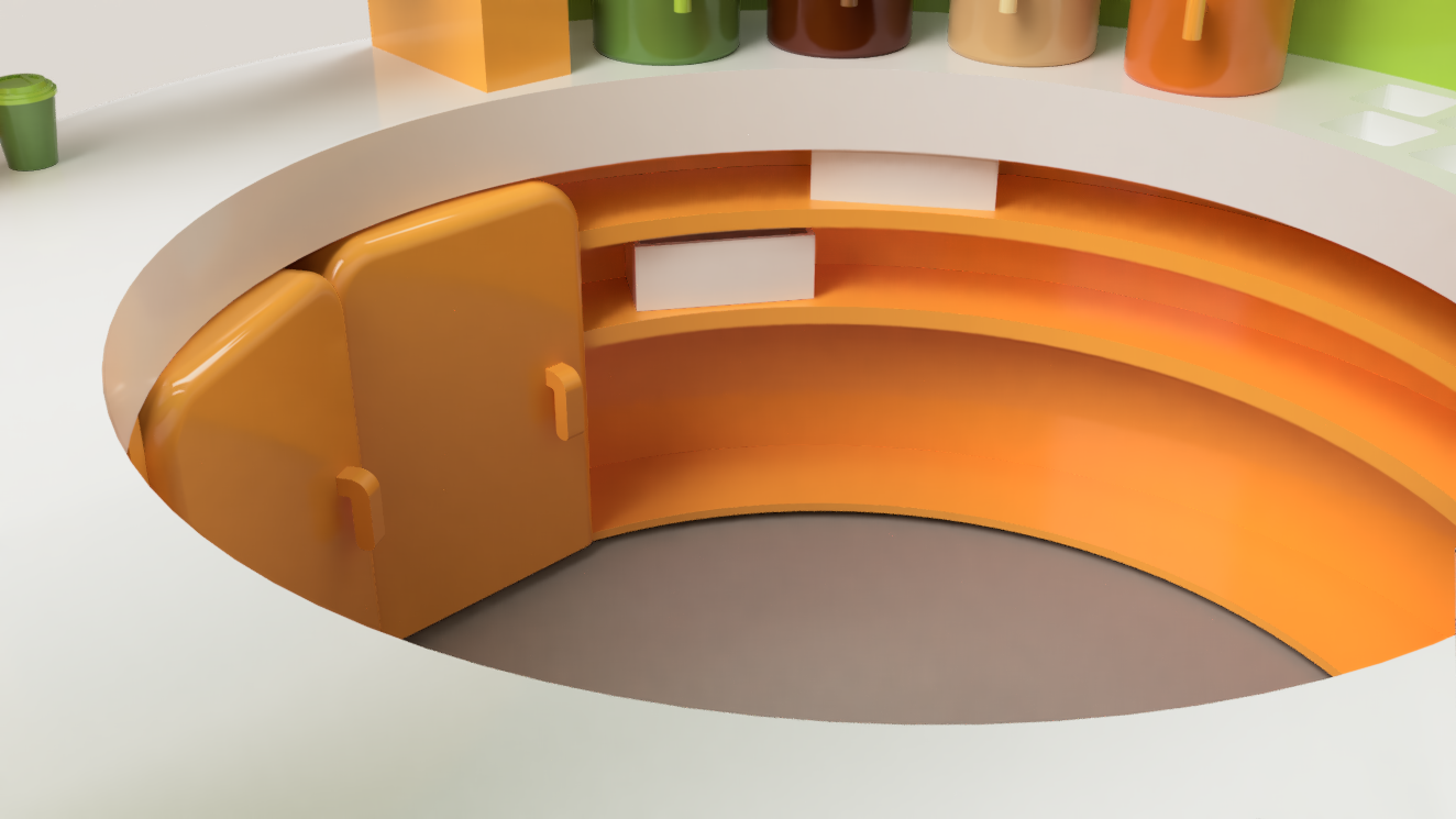
3D RENDERS
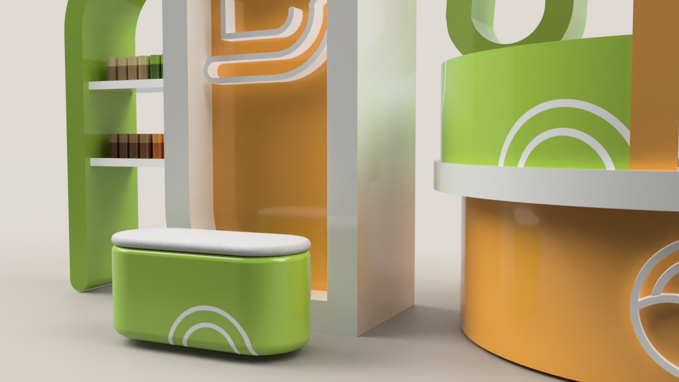
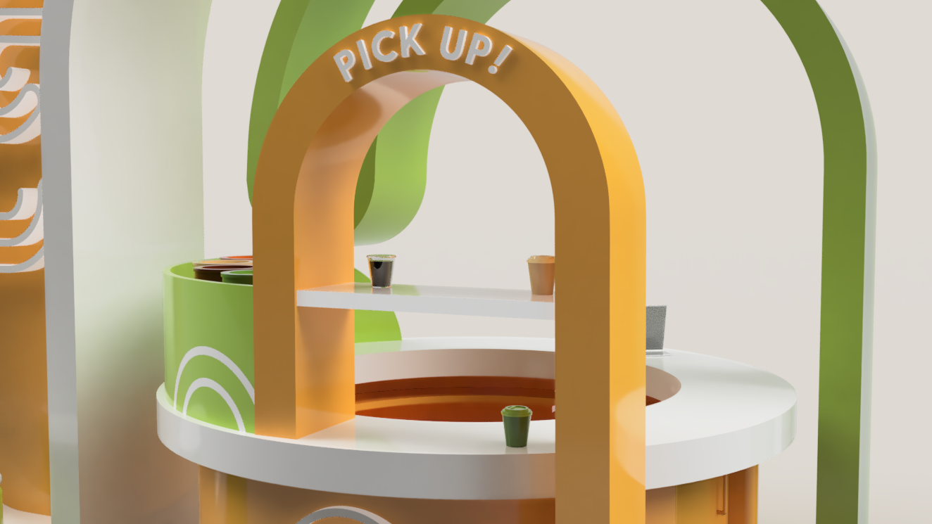
3D model of the kiosk, with ordering station, as well as product shelves.

MENU DESIGN
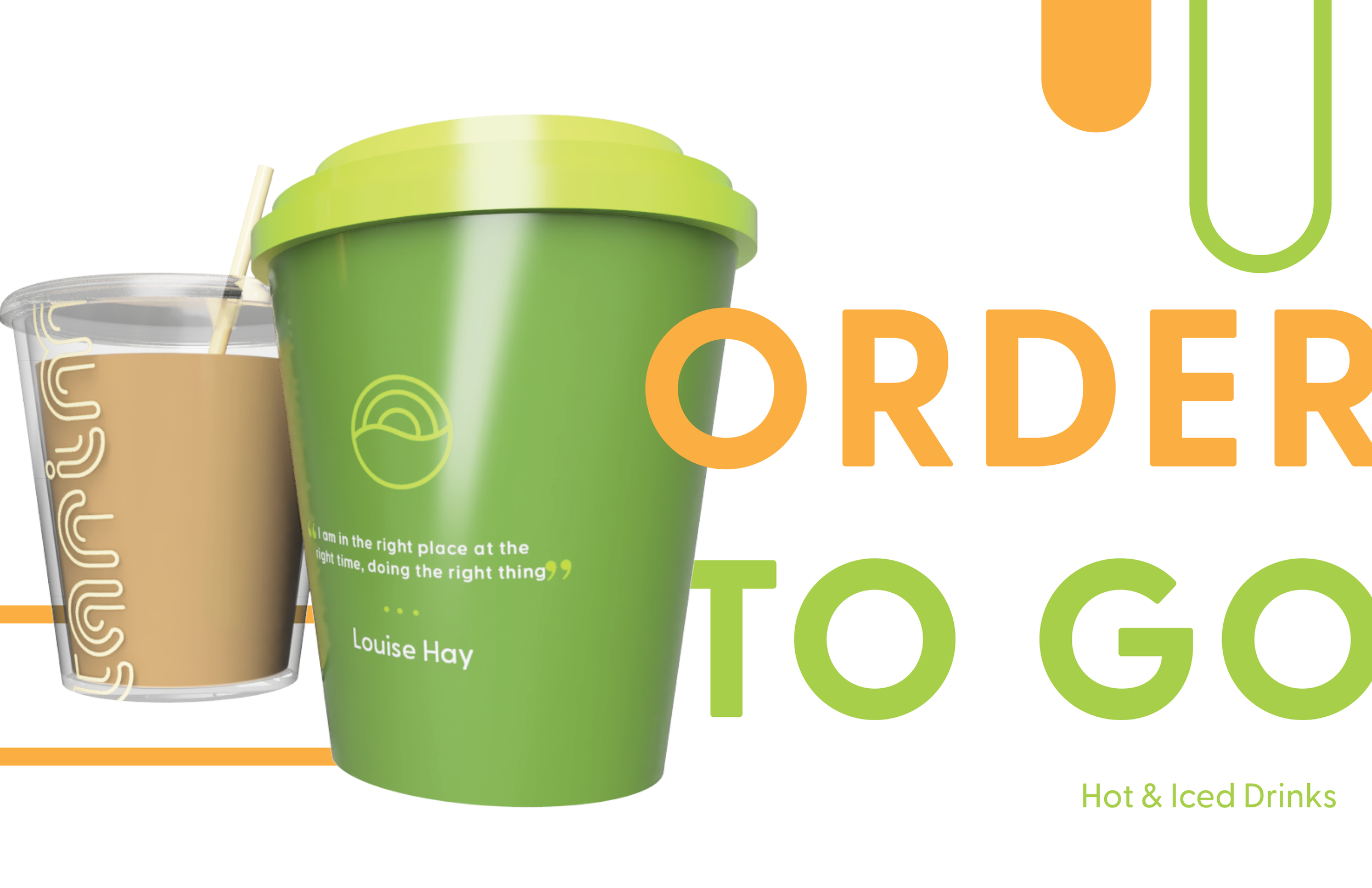
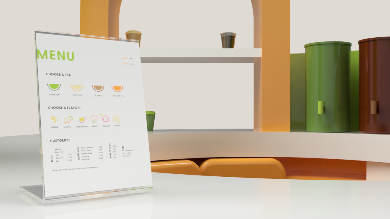
The kiosk menu offers guests a fully customized experience where they can create a drink to their liking by adjusting sweetness, iced or hot, ice level, etc.

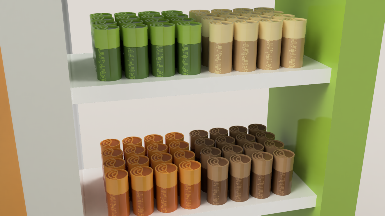
PRODUCT IMAGES
3D renders for the tea bag packaging and the to go cups.